Fourteen reports, one place to find them
Project
Fourteen reports, one place to find them
Year
2025 - 2026
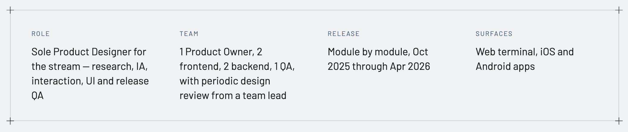
Reports are where a trader goes to prove what happened., what they made, what it cost, what they file at tax time. At FYERS those fourteen reports lived in different places, and several only arrived as a scheduled email. This is how they became one stream, and why the hardest part was navigation rather than any single screen.
Scope of Work

01 THE SHORT VERSION
The Reports hub as it ships., fourteen modules, four groups, every report one click deep.
Nobody browses Reports
Every order, trade, charge and corporate action a user touches leaves a record, and Indian brokerage is a regulated business., those records have to be retrievable, accurate and exportable. Reports is the part of a trading product people open with a specific purpose and leave the moment it is served.
That makes it a retrieval problem, not a discovery one. Fourteen modules, and each answers a different question in a different shape: a month of closed positions reads best as a calendar, an intraday P&L reads as a curve, a contract note is just a file the user wants in their downloads folder.

Three different ways to not find a report
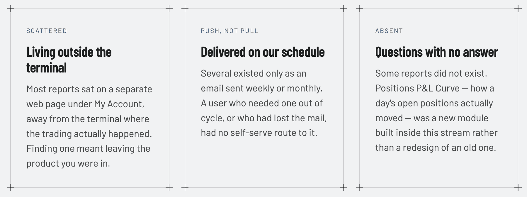
What users said when we stopped guessing
Three inputs shaped the stream: an analysis of support tickets raised against reports, interviews with users who used them regularly, and interviews with the internal teams., support, compliance, operations., who fielded the fallout when a report was hard to reach.
Support ticket analysis
Where users gave up and asked a human instead.
User interviews
How traders actually described the thing they came for.
Stakeholder interviews
What each report is obliged to contain, and what it cannot omit.
“I just come here to download my report for a specific date and I don't care about anything else.”
“Keep it specific to each report.”
“I want this to be easily accessible.”
What it changed
Users arrive already knowing the report and the date. They are not exploring, they are collecting. So the stream had to be built for retrieval., the shortest possible path from intent to file., and every report had to keep its own vocabulary rather than being flattened into one generic table.
Navigation was the whole design
With fourteen modules the temptation is to build a navigation system worthy of fourteen modules. That is exactly what the first approach did, and it is why it failed.
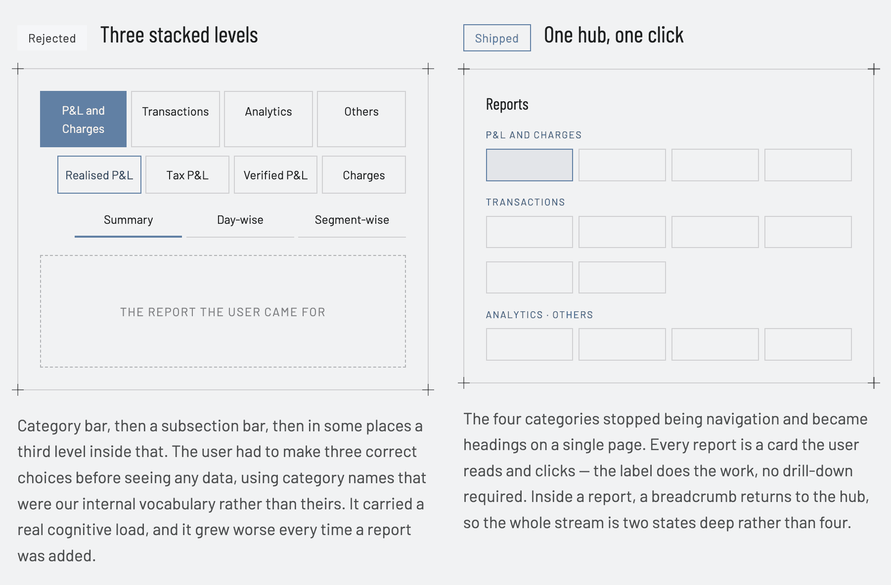
Why the flat hub wins., in principle!
Hick's Law
Decision time
Time to decide grows with the number and complexity of choices. The stacked navigation looks like it reduces choice., four options, then four, then three., but it charges the user three decisions in sequence, each on labels they cannot verify until they commit. The hub charges one, against labels they can read in full.
Miller's Law
Chunking
Fourteen flat items would be a wall. Chunked into four headed groups of two to five, the page is scanned as four objects rather than fourteen., which is why the categories survived the redesign as headings even after they were removed as navigation.
Fitts's Law
Target size
A tab in a nav bar is a few characters wide. A hub card is a large rectangle carrying a title and a sentence of description. The same click becomes faster and more forgiving, and it costs nothing but page area., which the hub has, because it is not spending it on navigation chrome.
Recognition over recall
Nielsen
The old structure asked users to remember which category a report had been filed under. The hub shows every report and its description at once, so the user recognises the one they want instead of reconstructing our taxonomy from memory.
Two doors, deliberately
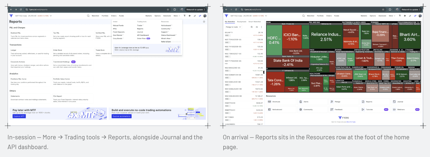
Traders and investors reach Reports from different states of mind. Someone mid-session wants it from the chrome they are already in; someone opening the app to check on things scrolls the home page. Both routes land on the same hub, and the breadcrumb inside every report returns there. Jakob's Law argues for exactly this kind of borrowing: a breadcrumb and a utilities menu behave the way they do everywhere else, so the pattern costs the user no learning and the design's novelty is spent where it earns something.
One shell, four view types
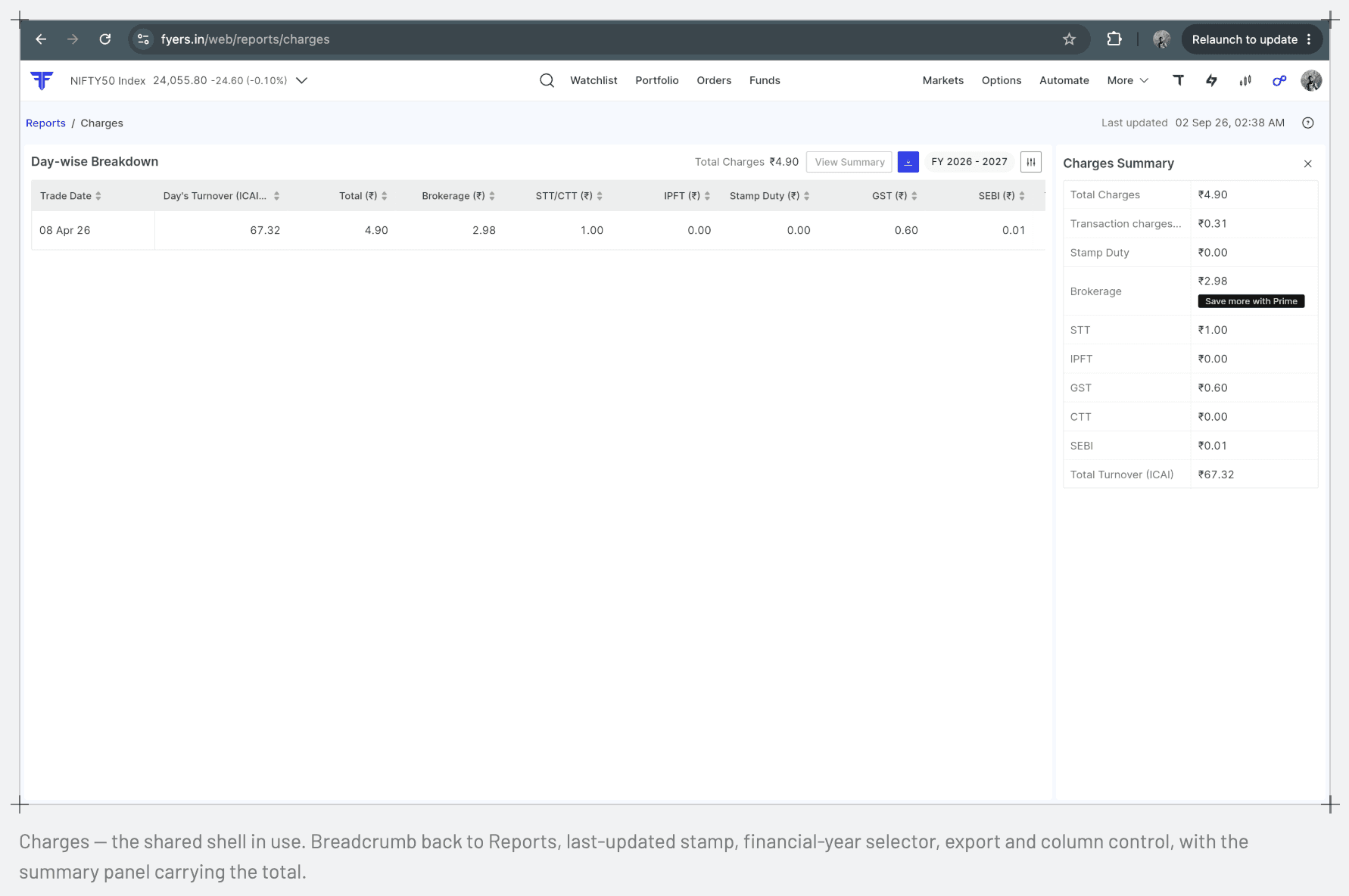
Fourteen modules cannot be fourteen one-off designs, and they cannot be one template either. The resolution was a shared shell that never changes., breadcrumb, last-updated stamp, period selector, export, column control., wrapped around a view type chosen by what the report is actually for.
View type | Why | Reports using it |
|---|---|---|
Calendar and table | The question is about a date or a stretch of dates, so the period is the primary axis. | Realised P&L · Trade Book · Order Book |
Table with summary panel | The total matters as much as the rows; the panel holds the number the user is really after. | Charges · Ledger · Tax P&L · Corporate Actions |
Graph | The question is about shape over time, which a table cannot answer at a glance. | Positions P&L Curve · Portfolio Value Curve |
Direct download | There is nothing to read on screen. Rendering a preview would only add a step. | Statements · FDs Report |
The relationships underneath the fourteen
Fourteen modules sound like fourteen decisions. In practice they cluster into families., reports that share a shell because they share a question, or share an audience because their output leaves the product. Seeing the clusters is what kept this from becoming fourteen separate designs.
Group 1
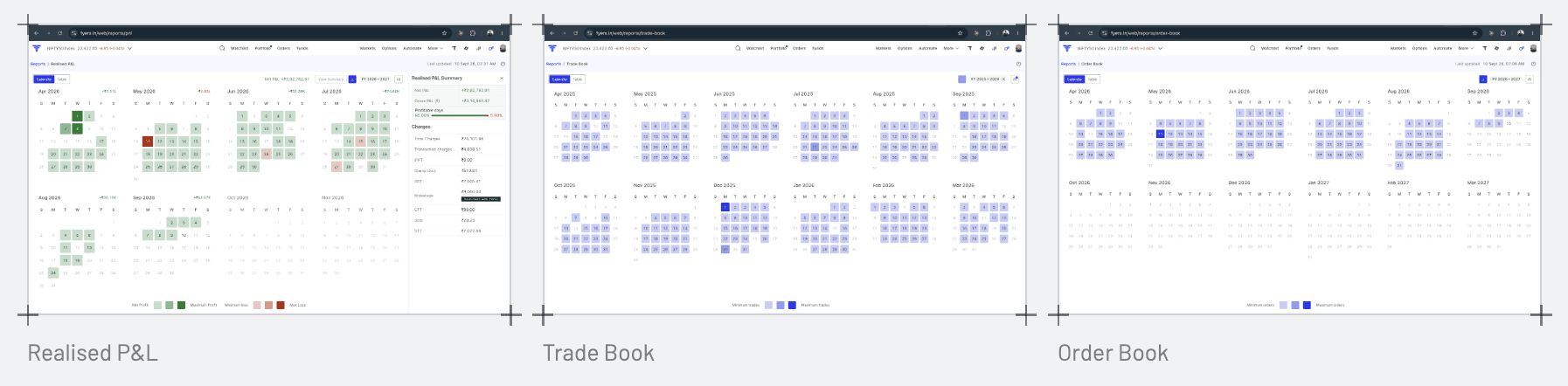
Realised P&L, Trade Book, Order Book., one shell, three record types
All three answer "what happened, on which day"., closed positions, executed trades, placed orders. They share the same calendar-plus-table shell, the same filters, the same export. Once Realised P&L was built, the other two were closer to a data swap than a new design., consistency, in Nielsen's sense, meant not inventing three interaction patterns for three record types that only differ in what they enumerate.
Group 2
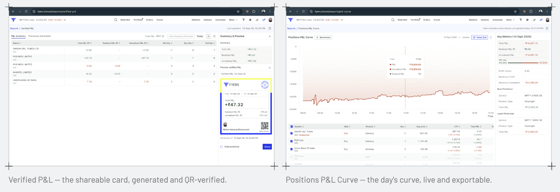
Verified P&L and Positions P&L Curve., built to leave the product
Verified P&L exists so a user can show someone else a trading result FYERS stands behind., most often on social media. Positions P&L Curve, once exported, gets used the same way by influencers and high-volume traders proving a day's work. Both are read by people who never open FYERS, so the aesthetic-usability effect carries more weight here than anywhere else in the stream: a shareable card that looks credible earns trust before anyone reads a number on it. It's also why Positions P&L Curve., a module with no predecessor, shipped last in the rollout., was designed for an audience of two, not one.
Group 3
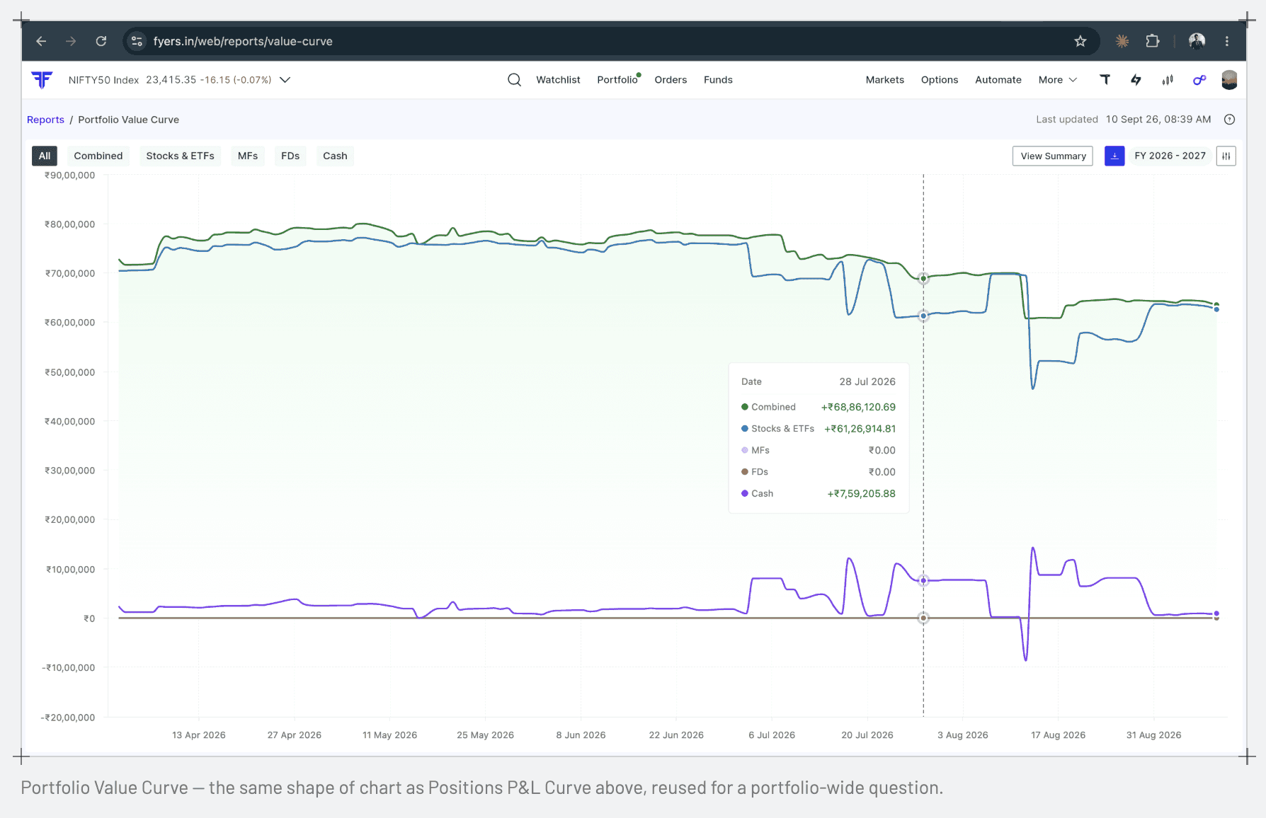
Positions P&L Curve and Portfolio Value Curve., one chart grammar, two questions
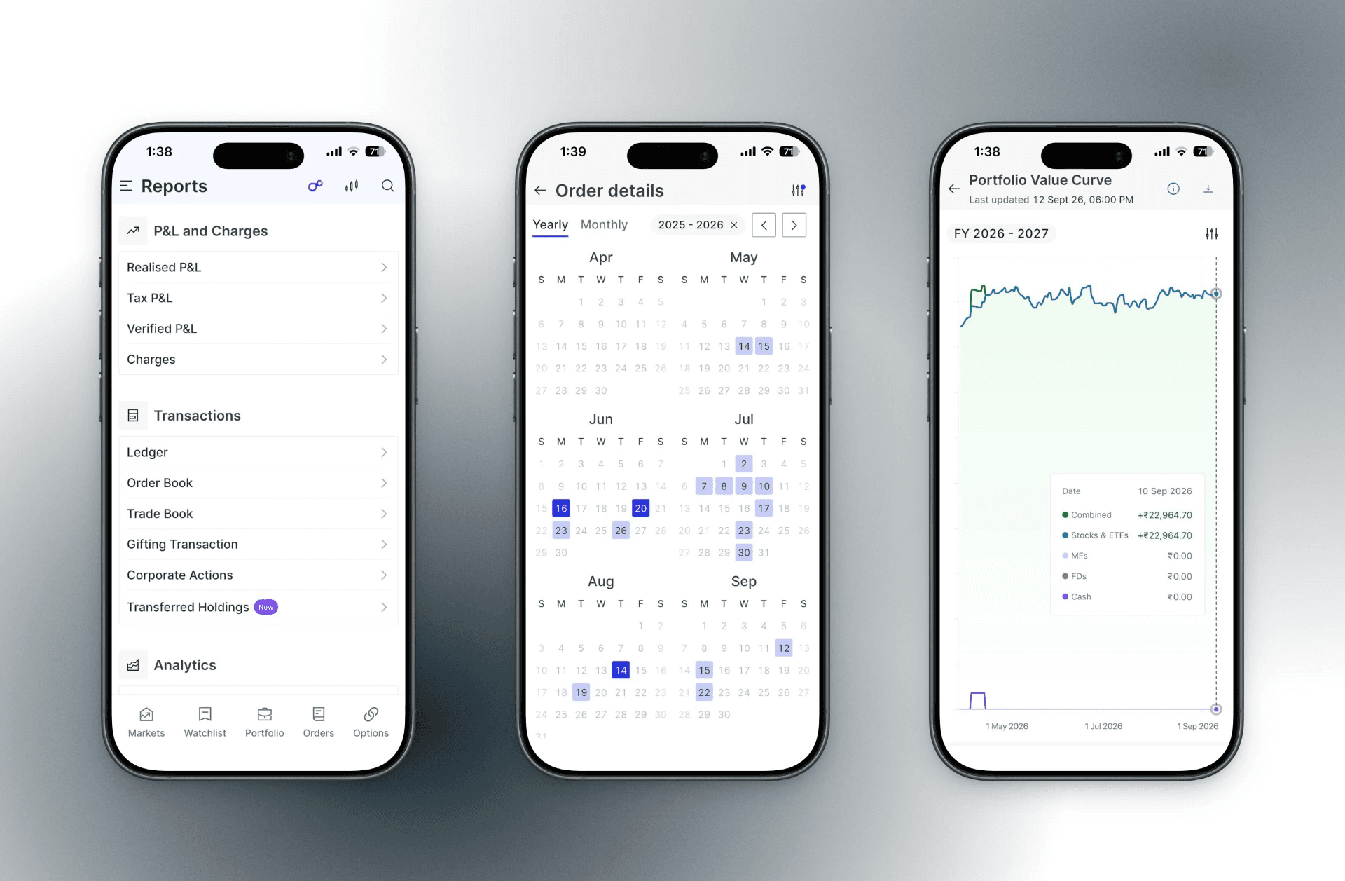
Positions P&L Curve answers "how did today go"; Value Curve answers "how has my whole portfolio moved". Different question, same axis logic, same line-and-area chart, same tooltip. Gestalt's law of similarity does the work here: once a user has learned to read one curve, the other asks nothing new of them.
Group 4
Tax P&L., the CTA that hands off
Tax P&L breaks down LTCG, STCG and turnover the way a filer needs it, but FYERS does not file taxes. The summary panel carries a direct link into ClearTax and Quicko rather than pretending to solve the last mile. It's the Pareto principle applied to scope: build the number for everyone, and point the seasonal minority who need to act on it at tools already built for exactly that.

Group 5
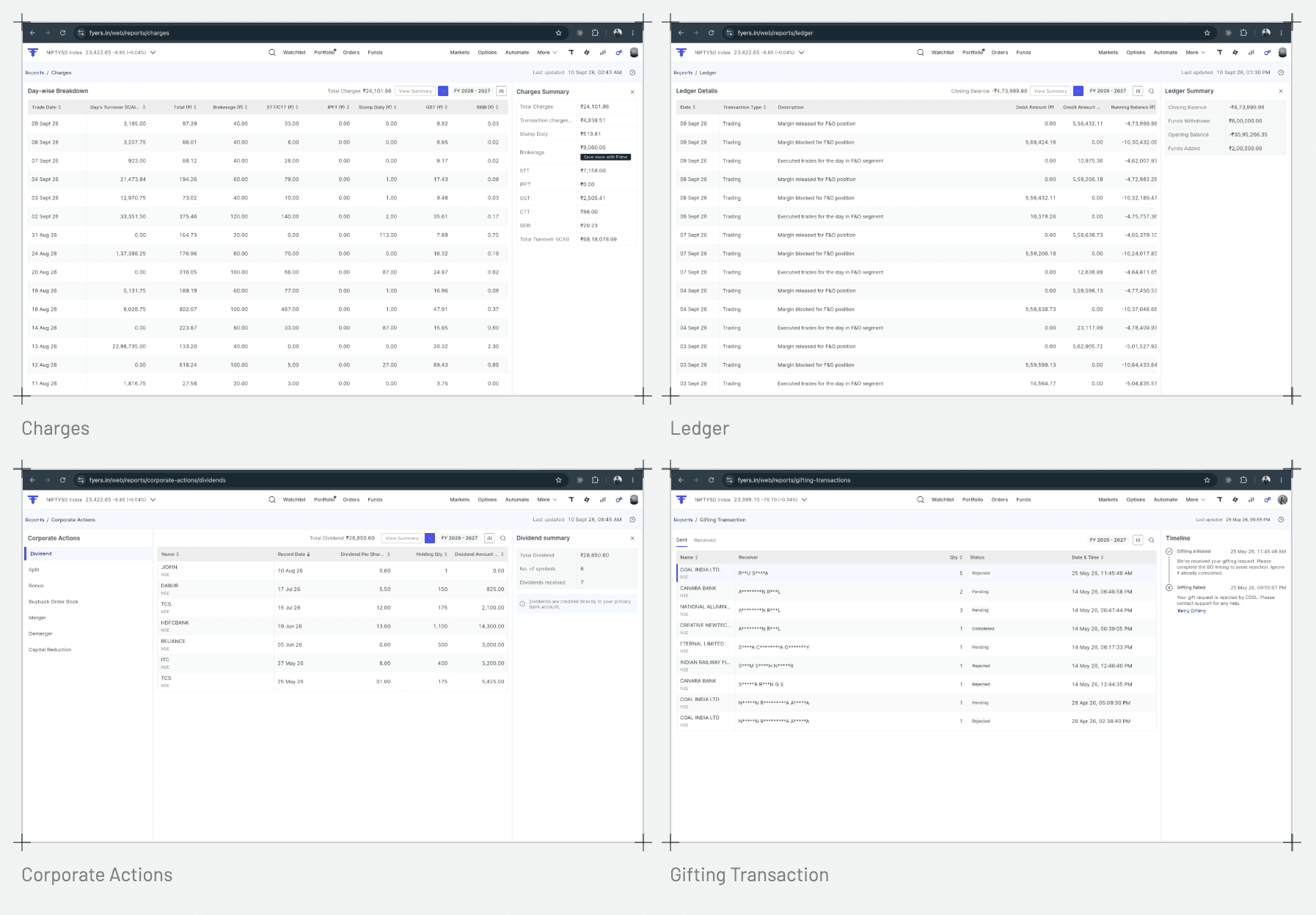
Charges, Ledger, Gifting Transaction, Corporate Actions., one filter-and-download pattern for four unrelated subjects
These four share nothing as data., fees, cash movement, gifted shares, corporate events., but the interaction is identical: filter by date or type, read the table, download PDF or CSV. Grouping the filter bar, table and summary into one bordered region on all four, per Gestalt's law of common region, tells the user "this is one unit of a report" regardless of which of the four they're in. Corporate Actions is the one exception worth naming: splits, bonuses and dividends are events a user notices in their portfolio before they understand them, so its rows explain what happened rather than just naming the action type.
Group 6
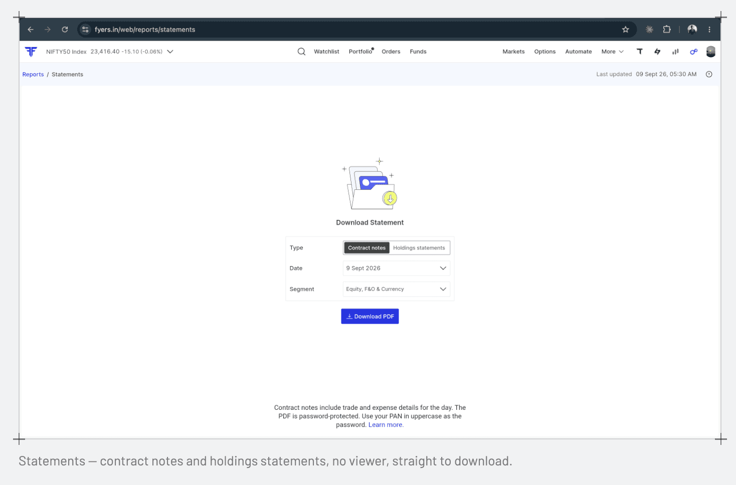
Statements., the one report with nothing to show
Statements is the only module with no on-screen view at all. The underlying data isn't available in real time, so contract notes and holdings statements are generated and emailed to the user on a schedule; the screen exists only so someone doesn't have to dig through their inbox for a PDF they already received. It's Nielsen's flexibility-and-efficiency-of-use heuristic in its plainest form., same content, two paths, and the user picks whichever is faster for them in that moment. It's also the report the research quote at the top of this page was about: download and go.
Constraints
What the design gave up
Graph fidelity took time to earn
The curve modules were designed with interactions that were hard for the frontend to build. Rather than cut the design down to fit a deadline, we held the line and gave engineering the time it needed to get there., the curves shipped with the interactions intact, just later than the rest of the stream.
Fourteen at once
A single-shot launch was never viable with one squad. Releasing module by module meant the hub had to work while it was partly populated, and every increment had to be coherent on its own., which is also why the adoption curve reads the way it does.
Platforms
Shipped three times over
The whole stream exists on web, iOS and Android. The hub survives the translation because it is a list of labelled cards; the view types needed more work, since a wide table and a calendar behave differently on a phone. I ran the pre-release pass myself on all three., desktop, an iOS device and an Android device., before each module went out.
Outcome
Adoption, module by module
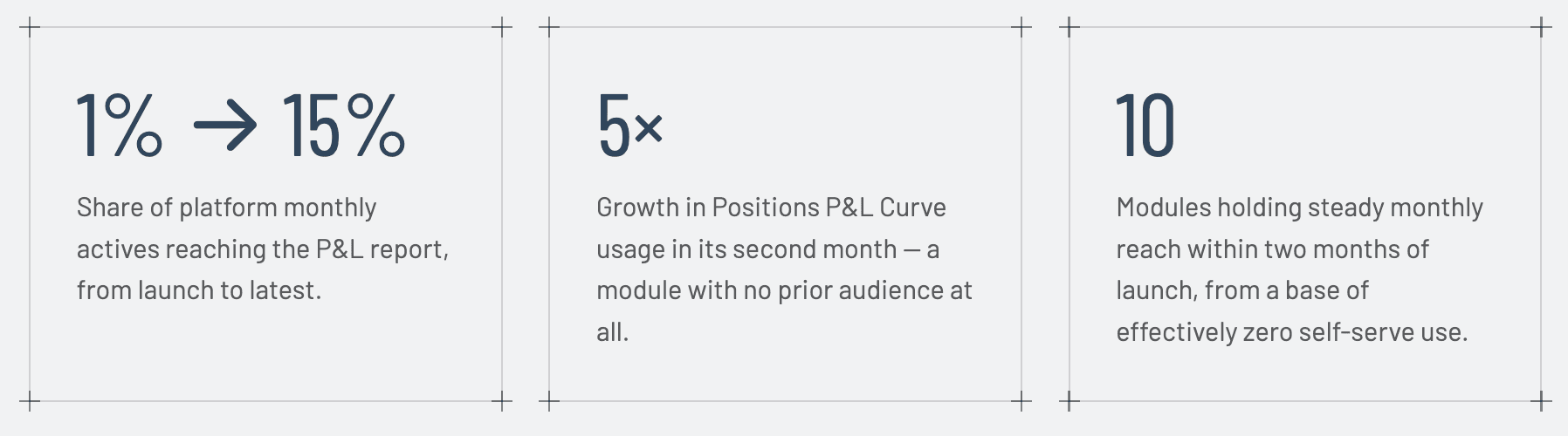
The stream rolled out incrementally between October 2025 and April 2026, one module at a time. Figures below are each module's monthly active users as a share of the platform's overall monthly actives., the same denominator throughout, so the columns are comparable across modules regardless of when each one launched.
Module | At launch | +2 months | Latest (Apr 2026) | Note |
|---|---|---|---|---|
P&L Report | 1% | 11% | 15% | Highest reach in the stream |
Tax P&L | — | 9% | 8% | Seasonal., peaks at filing |
Ledger | — | 6% | 7% | |
Charges | — | 6% | 7% | |
Verified P&L | — | 6% | 7% | |
Portfolio Value Curve | — | 6% | 4% | |
Statements | — | 5% | 5% | |
Order Book | — | 4% | 5% | |
Trade Book | — | 4% | 5% | |
Positions P&L Curve | — | 1% | 5% | Newest module, shipped last |
Reflection
What I would do differently
Test the grouping before building it
The four categories came out of the team's model of the product and held up in practice, but I did not tree-test them before we built. On a fourteen-item hub that is the cheapest test available and I skipped it.
Bring engineering into the curve work earlier
The graph modules were the only place where the shipped design was materially thinner than the intended one. Sketching those with the frontend team in the room would have produced a design that survived contact with the build.
Instrument the hub, not just the reports
Adoption tells me which reports get used. It does not tell me how long people spend choosing on the hub, or which cards get read and skipped., the measurement that would actually validate the navigation decision.
Close the loop on tickets
Support tickets opened the project and would have been the cleanest before-and-after evidence. Setting up that comparison at the start, rather than reaching for it at the end, is the habit to carry forward.