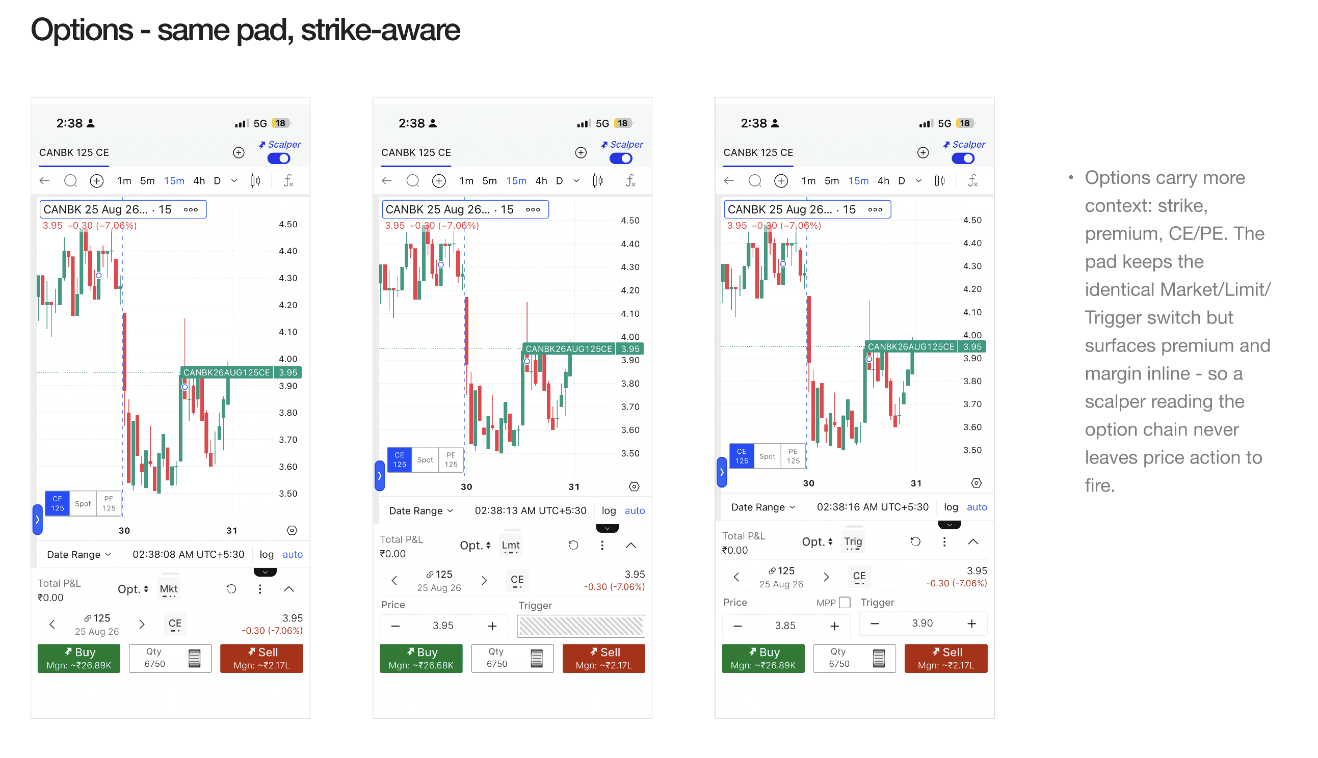
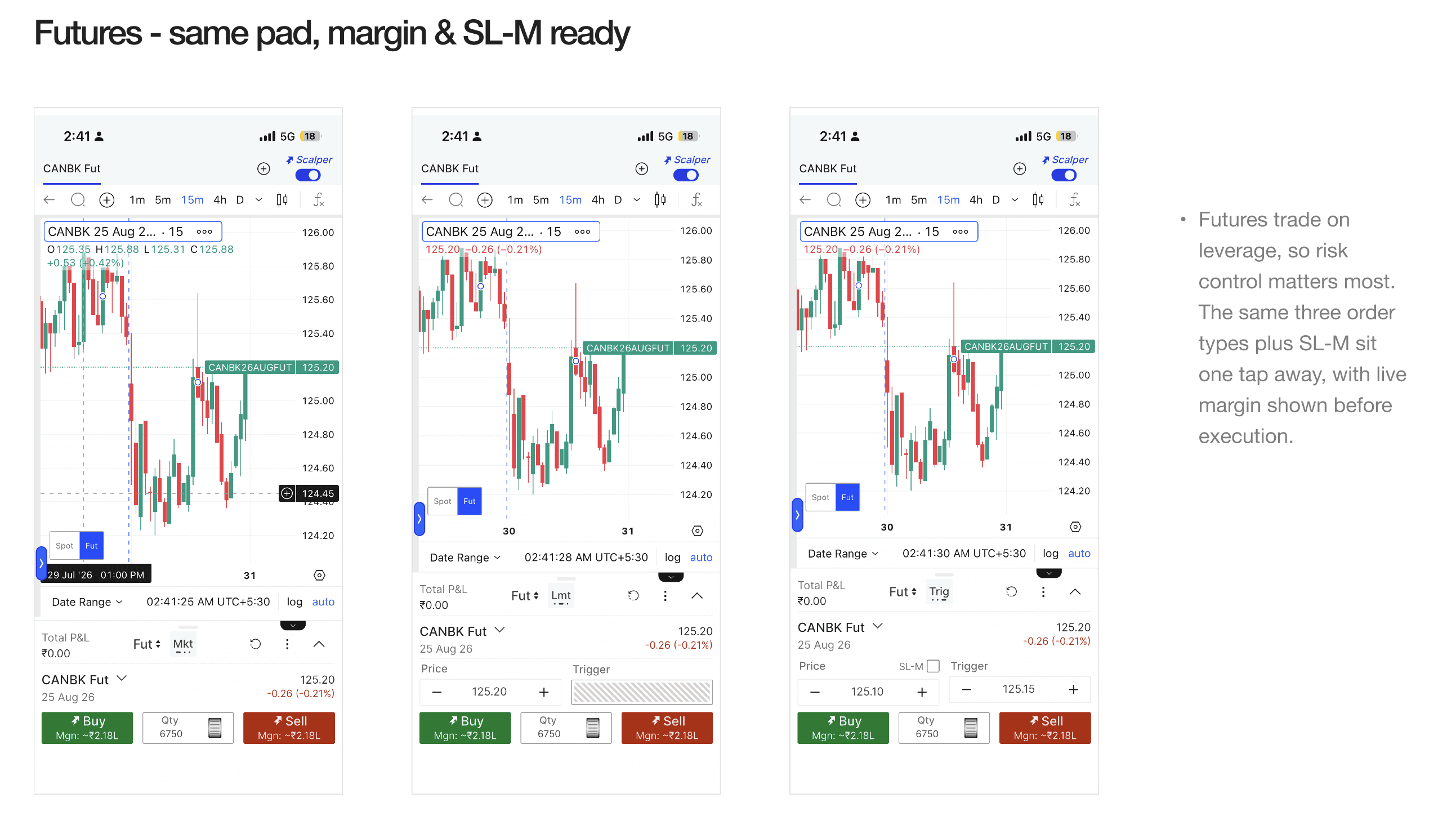
One order window. Spot, options, futures. Never off the chart.
Project
Fyers - mobile trading terminal
Year
2026
On a terminal handling 50,000+ orders a day, placing one meant leaving the live chart for a separate order screen., 4–5 taps for options, 3–4 for futures, and the price hidden for every one of them. Scalpers run that loop dozens of times a session, and they account for around a fifth of the platform's revenue.
I had one month, one PM and two engineers. Instead of improving the order screen, I removed it., an order window that lives under the chart, with one pattern that holds for spot, options and futures. It shipped to iOS and Android at the end of the sprint.
Scope of Work

01 THE SHORT VERSION
PROBLEM
Placing an order meant leaving the chart. I counted 4–5 taps from the option chain and 3–4 for futures., with the price hidden for every one of them.
WHAT I DID
Designed an order pad that sits under the live chart, then shipped one pattern across spot, options and futures., with a mode for each way traders actually place orders.
WHERE IT LANDED
Shipped to iOS and Android inside the month. Product reported roughly a fifth of active traders had switched it on in the first month.
Before we directly jump into this, let's under a Scalper.,
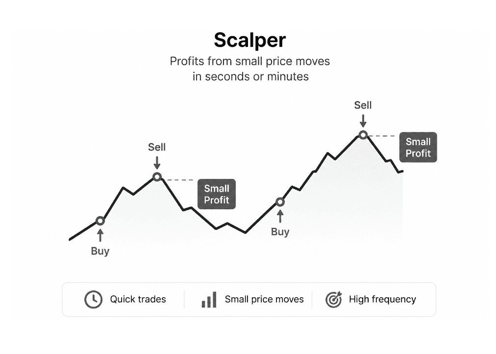
Scalping is a high-frequency trading strategy where traders buy and sell stocks within seconds or minutes to profit from small price movements. Success depends on speed, precision, and real-time decision-making, where even a few seconds of delay can impact trade execution.
Because traders constantly switch between analyzing live charts and placing orders, the trading experience must be fast, intuitive, and frictionless. Every interaction matters, making UX a critical factor in helping traders act with confidence during volatile market conditions.
02 THE PROBLEM
To place a trade, a trader had to close the screen they were making the decision on.
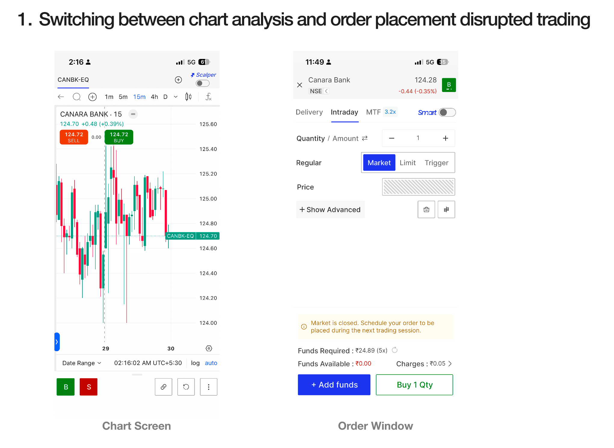
The terminal split the job in two. The chart was where the decision happened - a scalper watches price action and waits for a moment that lasts seconds. The order window was where the action happened, on a separate screen. So the instant a trader decided to act, the product took away the thing they were acting on.
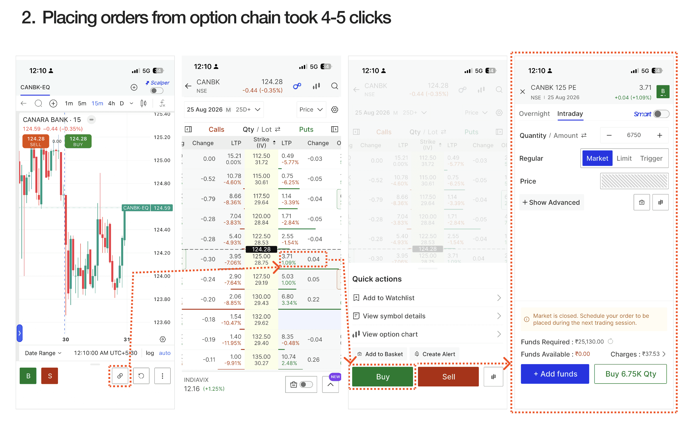
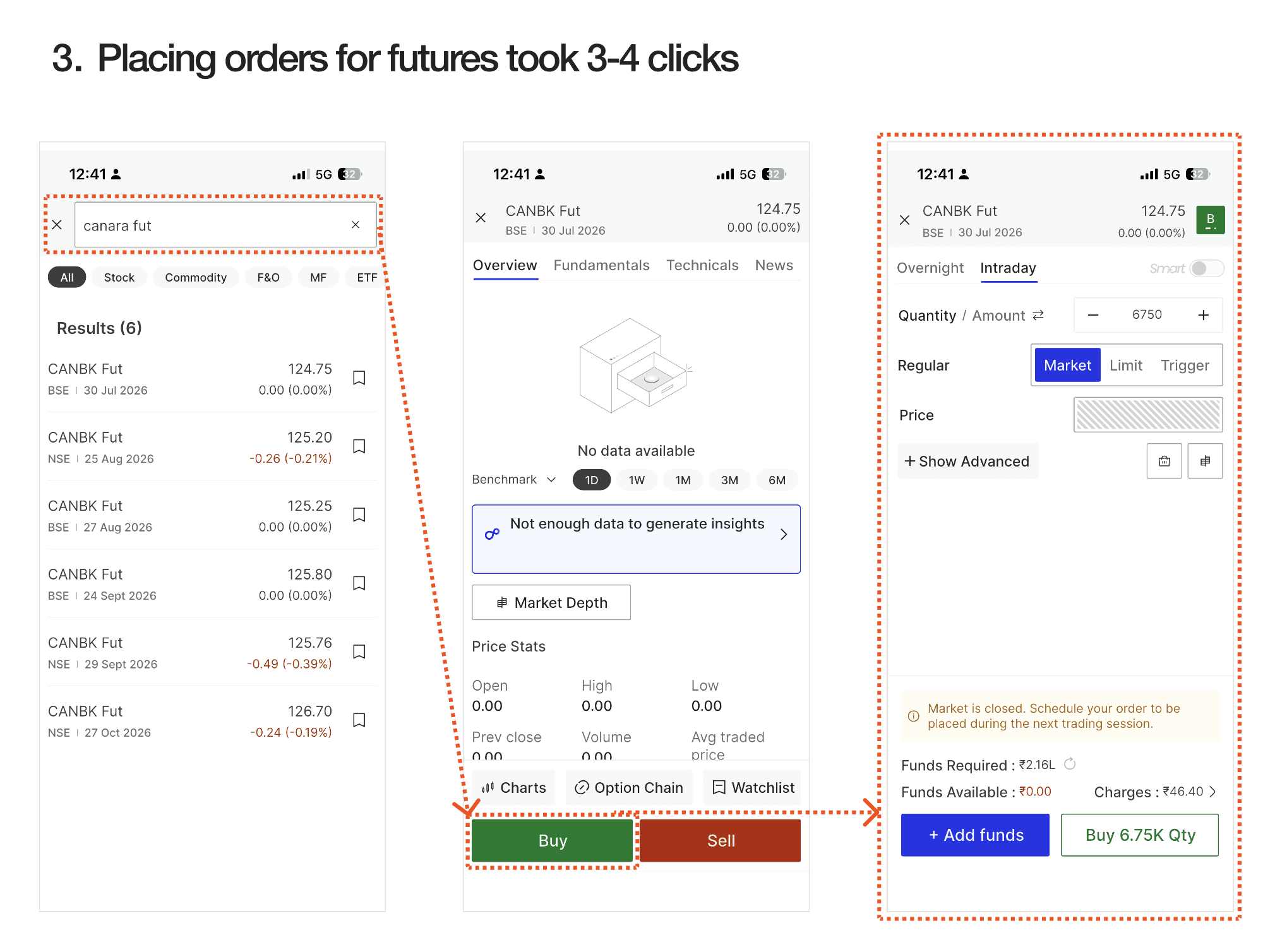
Rather than argue about how bad that was, I measured it. With a live account during market hours, I counted every tap between deciding and having an order in:
4–5 taps - options, from the option chain
3–4 taps - futures
0 - of those taps with the chart visible
Three costs came out of that count. Traders went blind at the worst possible moment, because price kept moving behind the order screen. They re-oriented on every trade, hunting for their place on the chart on the way back. And they re-entered the same order preferences every single time.
Individually, none of it was broken - that’s why it had survived. A scalper repeats this loop dozens of times a session, and at that frequency a few taps is the margin.
It was also worth fixing properly rather than patching. Active scalpers were a small share of our users and, by the platform’s own figures, around a fifth of revenue.
One flow, measured end to end
The decision starts on the chart. The old flow then sends a trader into a separate order window, turning a single action into a sequence of taps with the chart out of view.
WHAT TRADERS TOLD ME
Five traders, three different ways of placing the same order.
Five sessions, live market hours, traders using their own capital.
I sat with five active traders during live market hours, watching them trade their own capital. I expected a list of complaints about the order window. What I got was more useful: they weren’t doing the same job as each other.
Behaviour split three ways, and each pattern wanted something different from the pad first. A single generic flow would have been a compromise for all three, so I designed a mode per pattern instead - same pad, different defaults.
Standard modeWatches: Every order detail before confirming. Pad first: Full order form, quantity, price, and product type visible together. | Instant / Scalper modeWatches: Price moves that can last only seconds. Pad first: A one-tap market order, with no form in between. | Basket modeWatches: A multi-leg strategy across selected strikes. Pad first: Select, review, and place all orders in one action. |
03 THE DESIGN
One pad under the chart, and every instrument inherits it.
The pad sits below the live chart and never covers it. Three decisions made that possible.
01 - Take the space back before spending any.
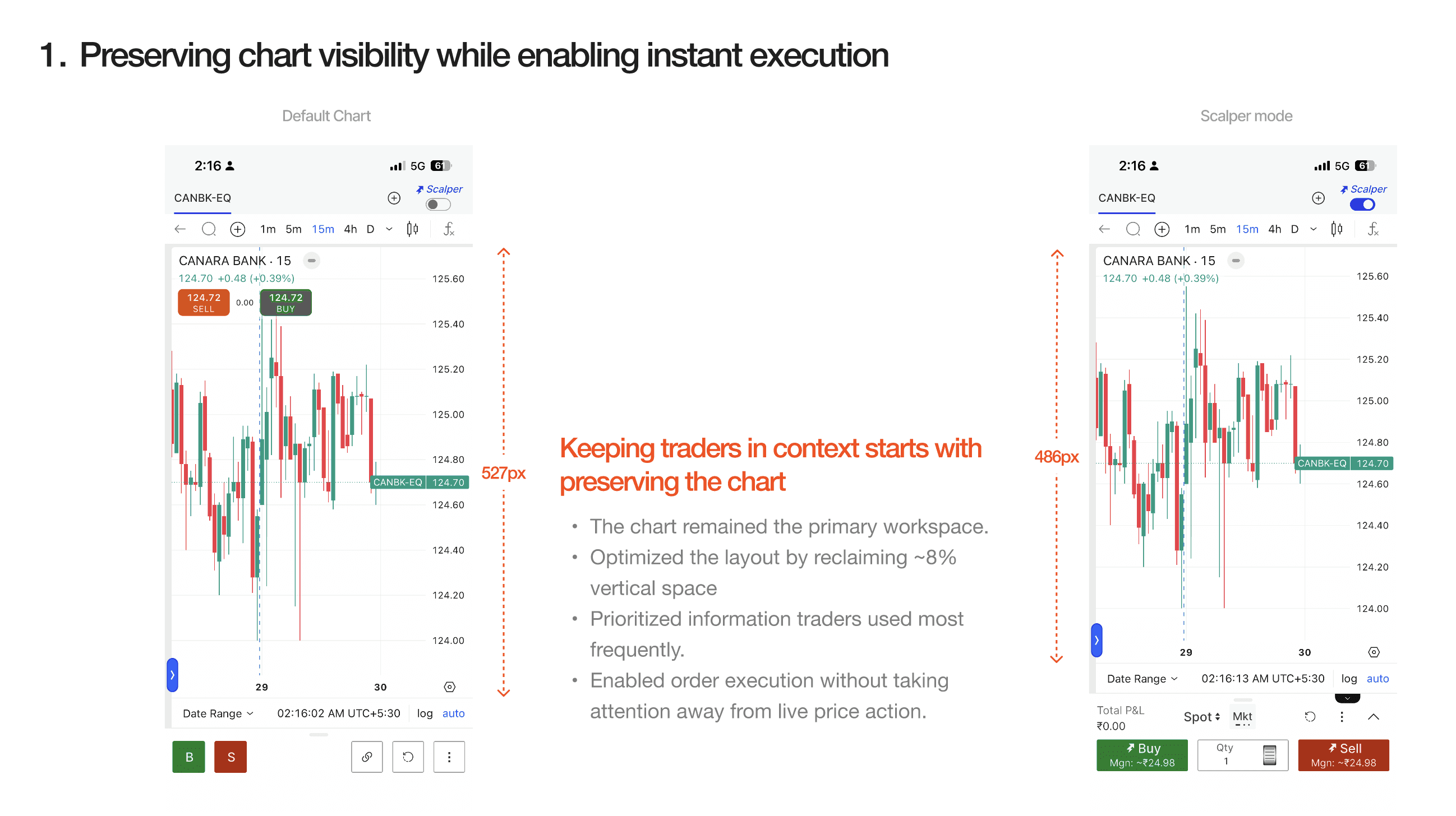
Before adding anything, I restructured the chart screen’s layout and reclaimed vertical height for the chart itself: 486px to 527px, about 8% more, without dropping a single control traders used. The pad had to be paid for out of space that was already being wasted, not out of the chart.
02 - Set preferences once, not once per order.
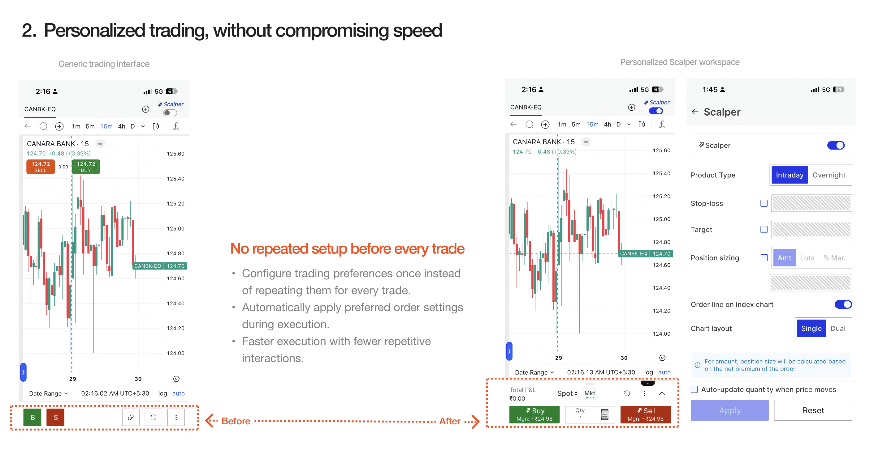
The old flow made traders re-specify the same settings on every order. Scalper mode holds them instead: product, quantity, order type, and validity are configured once and applied at execution. For someone firing dozens of orders a session, that’s the difference between a pad that’s fast and a pad that’s just a shorter form.
03 - One pattern, three instruments, no exceptions.
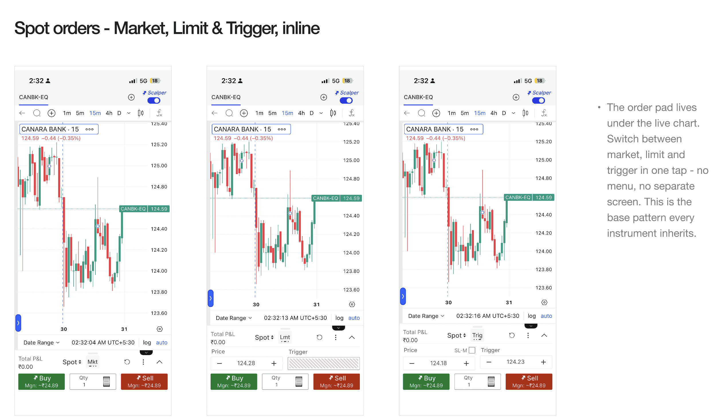
Market, Limit, and Trigger sit inline, one tap between them, with no menu and no separate screen. That base pattern does not change across instruments. Only what it surfaces alongside does.
Spot is the base: three order types, one tap apart. Options add strike, premium, and margin inline, so a trader reading the chain never leaves it to find out what a fill will cost. Futures add SL-M and live margin before execution, because leverage and risk are part of the decision.
One sheet, two jobs.
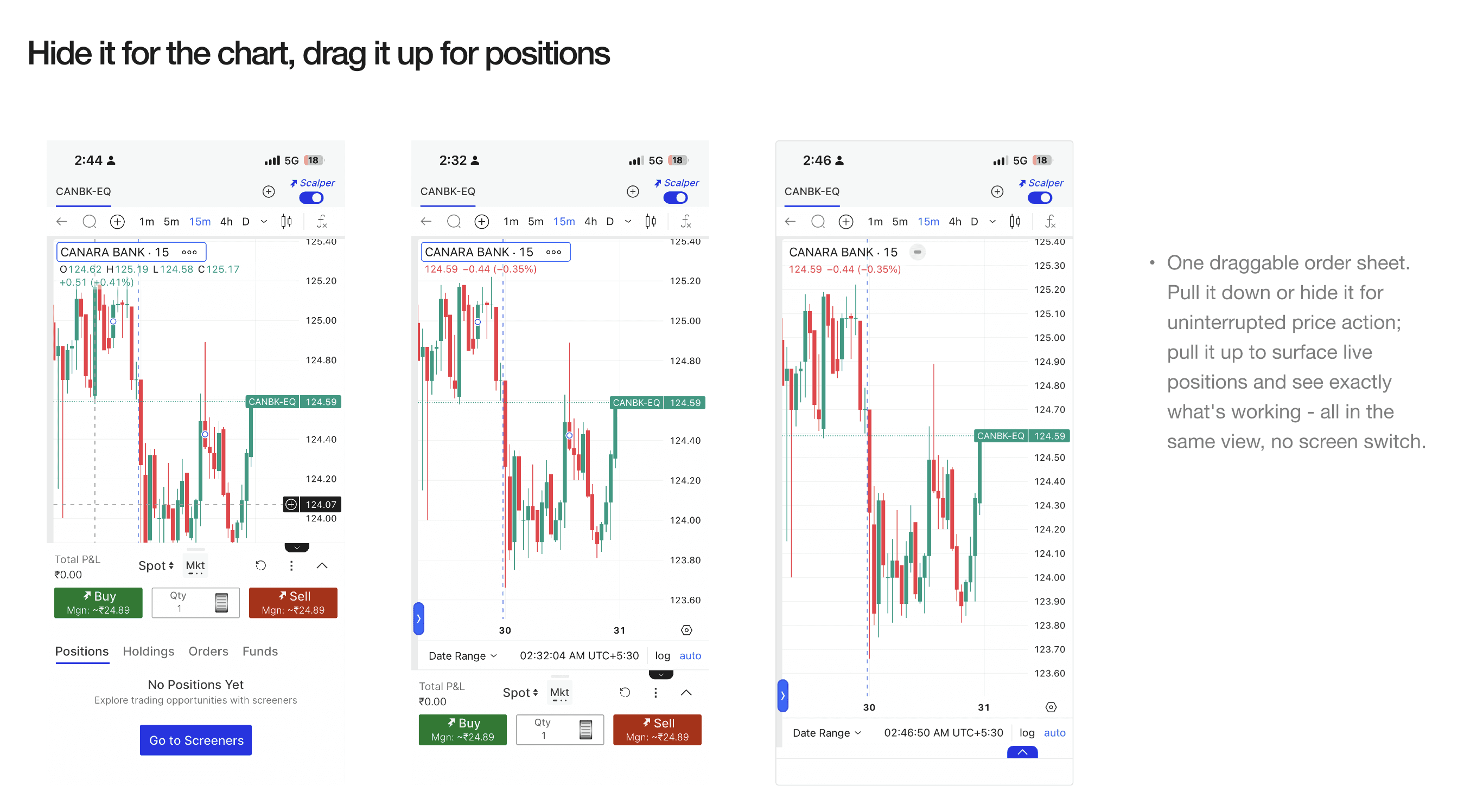
The sheet drags down for uninterrupted price action and up to show live positions. Same screen, no switch, so checking what’s working never costs the chart. Learned once, the pattern works everywhere.
04 WHAT CHANGED
Shipped in a month, and one pattern now covers every instrument on mobile.
Scalper mode shipped to iOS and Android at the end of the sprint. Product reported that roughly a fifth of active traders had it switched on within the first month, and session analytics showed screen-switching down by about a third against the old flow.
~20% of active traders switched it on in month one
Reported by product.
−32% screen-switching per active session
Session analytics.
50K+ orders a day the pattern had to hold at
Platform figure - scale, not my impact.
05 LOOKING BACK
The fix wasn’t a feature. It was a screen I removed.
My first instinct was to make the order window better. The order window was the problem. It took me longer than it should have to stop improving the screen and start asking whether it needed to exist.
Holding one pattern across three instruments cost me time up front. Options and futures each had a decent argument for being a special case, and talking them back into the shared pad was slower than building two would have been. It’s also the only reason the pattern scaled instead of splitting into three.
What I’d move earlier is the tap count. I ran that audit after the direction was already set; it should have been the first thing on the table. Once the team saw “4–5 taps, chart hidden for all of them” written down, the argument was over.